Hypertext Markup Language, commonly known as HTML, is the standard language for creating webpages. You can think of it as the framework for building websites. For example, this webpage you’re on uses HTML, and this paragraph you’re reading uses the
(paragraph) tag.
For now, don’t worry about HTML tags; we’ll discuss that in detail later. The most important thing to keep in mind is that almost every web page you visit uses HTML, which is used in roughly 96% of all websites.
This markup language lays the foundation for structuring and interacting with web pages. In other words, it’s the skeleton that supports all other aspects, including styling with CSS (Cascading Style Sheets) and interactivity with JavaScript.
-
Navigate This Article:
Understanding HTML
Let’s discuss the basics of HTML, specifically how they form the foundation for building webpages. This lesson is vital if you want to develop a website or application from scratch.
The Core Concepts
At its heart, HTML is about elements, tags, and attributes. In web development, we call them components. They work together to create the structure of your webpage.
Structure: Elements, Tags, and Attributes
Looking at the HTML structure, you’ll understand how elements, tags, and attributes function. Each element on a page has tags that dictate the type of content displayed in that particular section.
For example, the tag is for paragraphs. Attributes, on the other hand, are usually found within these tags. They define properties like style, links, or sizes.
Semantic Markup vs. Structural Markup
When writing HTML, you have two options: semantic or structural markup. Semantic markup uses HTML tags that give meaning to the content. For example, shows that the section in question is a footer. Semantic markup helps both browsers and developers understand the role of the content.
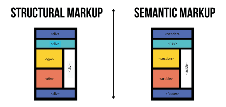
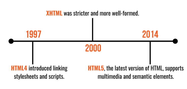
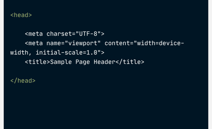
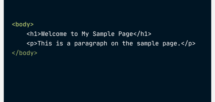
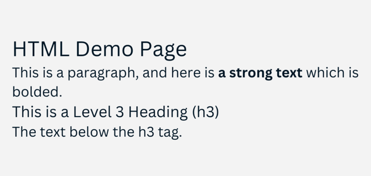
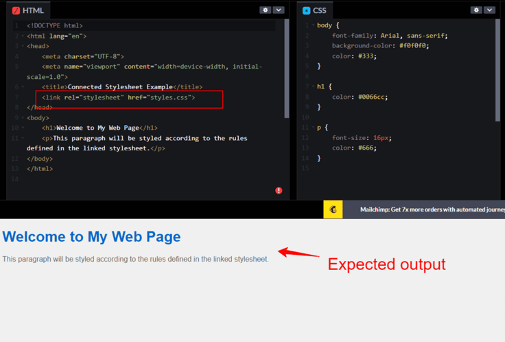
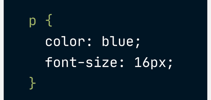
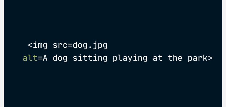
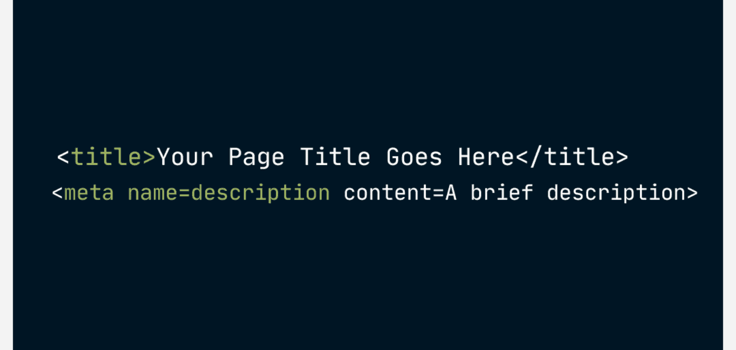
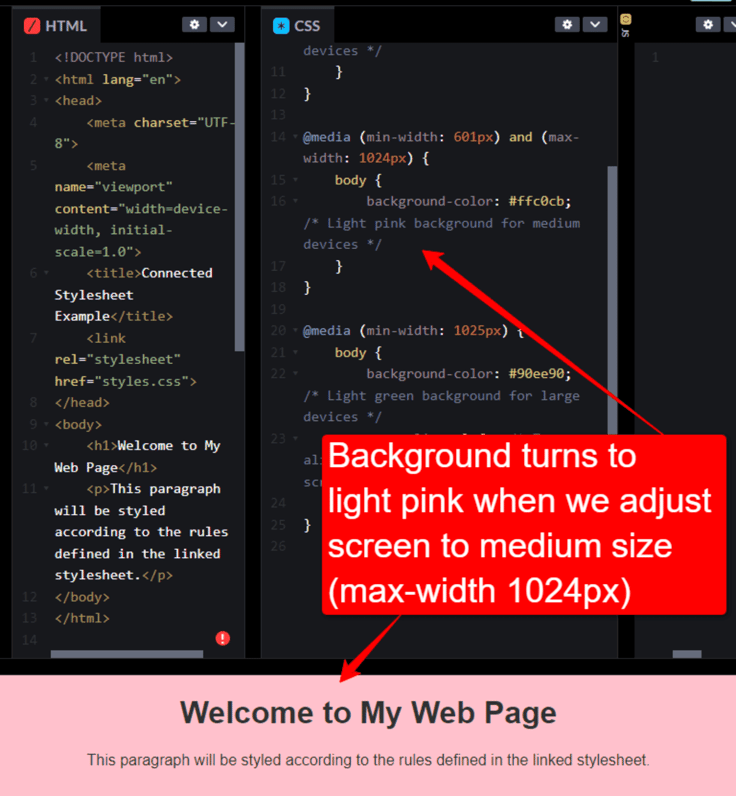
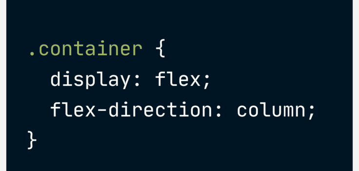
Structural markup shows the structure of the content as it appears on the webpage. For example, The key difference between semantic and structural markups is that the former shows the role of that particular content. At the same time, the latter does not usually indicate the type or purpose of the content. An HTML document starts with a DOCTYPE declaration. This declares the version of HTML applied to that document. The declaration is then followed by the root element. Inside this element, you’ll find the and sections. The HTML has evolved significantly since its inception, mainly to adapt to the needs of modern web developers and browsers. Here’s an overview of how HTML has changed over the years. The first ever version of HTML was released in 1993 by Tim Berners-Lee, a British computer scientist. It’s worth noting that the 1993 version wasn’t official — it was only a proposal. One month later, the second version was released. Since then, there have been massive changes to its structure. Here are some key milestones worth mentioning: HTML4: Introduced in December 1997, this version of HTML brought in features like the ability to link stylesheets and scripts. XHTML: Introduced in December 2000 as an XML-based version of HTML, XHTML was stricter and more well-formed than HTML4. For example, in HTML4, you would write the tag As a result, to render an image in XHTML, you’d write something like this: HTML5: HTML5 is the latest version of HTML. Released in 2014, it supports multimedia elements like and You can even add more semantic elements such as An HTML document is structured so that browsers can read and display it on the web. This structure includes various elements that define everything from the content to how the page should behave. Let’s take a closer look. Any standard HTML document has two sections: the head and the body. The document may have other sections, but you’ll find them wrapped inside these two. The head section contains meta-information about the document, which defines and controls the setup of your webpage. Here’s what it looks like: This section has everything to do with browsers and search engines. It tells the browser how to load the page and informs search engines what the page is about. The body section contains all visible content, including text, images, videos, links, and other media. Here, you can use headings to structure your content hierarchically, paragraphs to break up text, lists to organize information in an easy-to-read manner, and images or videos to add visual elements. HTML elements are the building blocks of web pages. Each helps structure and display content effectively. To demonstrate how they work, we’ll break them down into three categories: text, structural, and interactive. As expected, text elements organize and highlight text-based content on the page. For example, this paragraph you’re reading now falls inside the elements used for paragraphs. Other common text elements include Check out the code below as an example. It uses the following text-based elements: h1, p, strong, and h3. Here’s the expected output: In essence, HTML is just imagining your computer as someone who speaks a different language. When you provide HTML, it’s like giving them precise instructions in their native tongue. For example, saying, “I want an H1 followed by a paragraph, then an H3, and more paragraph text,” is like giving them a clear, step-by-step guide to exactly how you want your content to appear. Structural elements are what you need to organize webpage layouts more semantically. They make web pages easier to navigate and understand. Imagine trying to read a huge block of text containing thousands of words. It is not only straining the eye but also quite unpleasant to look at. That’s where structural elements come in to make your text more presentable. For instance, you can use Interactive elements create some of the features you interact with when you visit a webpage. These elements allow you to perform specific actions, like submissions or redirections. For instance, the element is what we use for hyperlinks. In addition, creates clickable buttons, is used for user input fields, and is used for complete user input forms. When working with HTML, you’ll realize that it’s not just about writing code, although that’s the most important part. You must also decide what text editor to use, understand the fundamentals of writing HTML, learn how to validate your code (especially if you’re a beginner), and more. Let’s begin with the most important part: writing HTML code. Here, you’ll need to use a series of elements and attributes to structure web content, as we discussed earlier. It’s important to understand how HTML works and write it correctly in a way that users, browsers, and search engines can interpret. Regarding writing, you must also decide where to write your code. That brings us to the next section. Text editors are lightweight programs that we use to write and edit code. You can opt for text editors, such as Notepad, because they are simple and fast. However, there’s a catch: you must remember HTML syntax and be careful with your coding. Any syntax error could prevent your code from running. For this reason, I would recommend this option only if you’re comfortable with your coding skills. On the other hand, Integrated Development Environments, also known as IDEs, have more robust features. IDEs like Visual Studio Code or Atom provide tools and functionalities that help streamline coding tasks, from writing to testing your HTML. Pro tip: The choice between a text editor and an IDE often depends on your workflow preferences and the complexity of your projects. HTML has some syntax rules and best practices you should follow if you want clean, well-organized, and easily maintainable code. The last thing you want is to spend your precious time troubleshooting your code because it just can’t seem to run properly. Knowing basic rules like proper nesting and closure of tags, using semantic elements appropriately, and keeping your code readable with consistent indentation and comments can help avoid many issues later on. Also, think of other developers who are working on your code. If you don’t follow these syntax rules and best practices, they’ll have a rough time understanding your code. Smooth collaboration is key to building applications from scratch. Thankfully, you don’t have to guess whether you’ve written the correct HTML; you can use validation tools such as W3C Markup Validation Service to check if your code works. If, for some reason, your code doesn’t work, the validation tool will identify the error. The whole point of validating your HTML code is to ensure it conforms to web standards and behaves as expected across different browsers and devices. This process makes coding much easier and more fun. Once you’ve set up the structure of your HTML pages, the next step is to make them look good, and that’s where Cascading Style Sheets, or simply CSS, come in. Here’s what you need to know: We use CSS to style and lay out web pages. Unlike inline styles, which mix the styling directly with the HTML structure (not advisable if you want to style several elements on the webpage), CSS keeps the styling separate. Later in this article, we’ll discuss why we separate HTML from CSS. To apply CSS styles to an HTML document, we need to link a CSS file to the HTML file we want to style. We place the link in the section of the HTML file using the tag. Below, I’ve used Codepen to create HTML and CSS files. In the screenshot above, I’ve instructed the browser to fetch and apply the styles defined in styles.css to the corresponding HTML document. Within the CSS file, we define styles for elements using selectors, such as element names, IDs, or classes. Once we’ve defined them, we also declare what those styles should be. The declaration happens within the braces. Here’s an example: In the example above, we want all paragraphs (usually wrapped inside the If you place HTML and CSS inside the same document, the code will run as expected. However, maintaining or scaling that code will be difficult. You’ll need to edit both HTML and CSS to change or update the style. That alone increases the chances of creating errors — or “bugs,” as we say in web development lingo — throughout the editing process. That’s why we separate these two. You won’t need to touch the HTML when updating the CSS code, and vice versa. The web development process isn’t solely about coding and styling. Yes, these two are important, but you should also make sure that your site is accessible to all users and optimized for search engines. Accessible HTML content, in this context, means that everyone, including people with disabilities, can access and use your website. Here’s how to make your HTML code accessible: For example: These descriptions help screen readers convey what the image is about to users who cannot see them. If you want your site to rank in search engines like Google and Bing, you’ll need to implement search engine optimization. Here are some of the best SEO-friendly HTML practices: For best results, you should include relevant keywords in your These elements help search engines understand and index your page correctly. Pro tip: Consider conducting a Lighthouse audit to check whether your HTML website is accessible and SEO-friendly. Lighthouse is an open-source, automated tool from Google that you can run directly in the Chrome browser to audit your site for performance, accessibility, progressive web apps, SEO, and more. Earlier, we mentioned that HTML5 had newer features and enhancements. Now, let’s take a deeper look at these improvements and their roles. HTML5 introduced new semantic elements that make the web more accessible and logical. With the new version of HTML, developers can use elements such as Speaking of readability, the new semantic elements sound more logical. The element , for instance, clearly tells you what that section is about. The new version of HTML also enhanced multimedia support. You can now add video and audio to your webpage without needing third-party plugins. The element is another prominent feature that came with HTML5. You can use it to run graphics and animations, including video games on a webpage. Other notable enhancements include better input control and validation. We’re talking new elements like , which suggests autocomplete options, and and Beyond the user interface, HTML5 introduced powerful APIs like geolocation to determine the user’s physical location, web storage for client-side data storage, and web workers to perform background tasks without interfering with the user interface. Now, let’s discuss another important part of writing HTML: responsive web design. In a nutshell, responsible web design means making sure that a website provides a great experience across different devices and screen sizes. The primary goal of responsive design is to build webpages that detect the visitor’s screen size and orientation to change the layout accordingly. For example, if you’re using an iPhone 12, the website you’re browsing should adjust itself to fit the phone’s screen size. This responsiveness eliminates the need for device-specific versions. Think about the number of devices you can use to access a website. You’re probably looking at different types of iPhones and countless versions of Android devices. We haven’t even mentioned tablets and computers. The list is endless. It doesn’t make sense to build different versions of the same website just to make it visible on each device. Instead, you only need to make the website responsive to stay visible and usable on different devices. You can build mobile-first, responsive websites using a combination of HTML properties and CSS techniques, such as media queries. If you want to create responsive layouts with HTML, you have different options. Some website builders come with ready-made drag-and-drop builders, meaning you won’t have to write a single line of code. Even so, they still have some form of built-in responsiveness. If you’re writing HTML from scratch, you’ll need to learn a thing or two about CSS techniques like media queries, Flexbox, and CSS Grid. Let’s start with media queries. These are powerful tools in CSS that allow you to apply different styling rules based on the conditions of the device, such as its width, height, or orientation. For example, you may want to change the layout, font size, or visibility of elements depending on whether a user is on a mobile device or a desktop, as shown in the screenshot below. Flexbox and CSS Grid are modern CSS layout techniques for distributing space and aligning content in complex layouts. Flexbox works mostly with one-dimensional layouts — either a row or a column — while CSS Grid best fits two-dimensional layouts (both rows and columns). The fundamental similarity between these two is that they both allow for responsive design elements that stretch or shrink to fit the display. Here’s an example: In this example, .container will lay out its “children” in a vertical stack, adjusting each child’s size to fit the device’s screen. It’s important to understand the best practices and optimization techniques if you want your HTML website to be functional, efficient, and accessible across all platforms and devices. Below, we’ll briefly discuss some great ways to implement these techniques. At first, using clean and semantic HTML markup sounds like rocket science, but it’s not. On the contrary, it’s simply structuring your HTML documents clearly and logically while using HTML elements according to their intended purpose, as we demonstrated earlier. This not only helps with SEO but also improves accessibility. Remember, the goal here is to make your website easier for humans to read and understand, as well as search engines, web browsers, and assistive technologies. That’s why it’s generally good practice to opt for semantic elements like One great way to achieve better performance is to reduce load times and improve responsiveness. These two techniques should be good enough to get you started: Minification and compression: Minifying and compressing your files (HTML, CSS, JavaScript) reduces their size, making them load faster from the web server. Heavy websites take longer to load, especially if not optimized for speed and performance. The “heavy” content doesn’t always have to be images or videos. Sometimes, the code itself could be the problem, which is easy to fix through minification and compression. You can even use tools like UglifyJS for JavaScript and CSSNano for CSS to automate this process. Asynchronous loading of scripts: Scripts can block how your webpage loads, and that might not even have anything to do with your internet connection. That’s why there’s something called asynchronous loading in web development. It means instructing your webpage to load scripts simultaneously. As a result, the rest of your content can load without waiting for the scripts to complete. Another thing you need to keep in mind is how your code looks and functions on different browsers. There are dozens of browsers to choose from, and some may not support the latest HTML5 features. Therefore, you need to make sure your website works across all major browsers if you want to create a consistently positive user experience. To do this, consider testing your site on different browsers and devices to ensure consistent behavior and appearance. You can even use tools like BrowserStack to automate this process. HTML is the foundation of all web development. It’s the first step on your journey into creating interactive, dynamic websites that engage users and deliver seamless digital experiences. Without HTML, web pages would lack proper structure, have no content to style with CSS, and have no elements to manipulate with JavaScript. The language has evolved since its inception in 1993. Today, we have HTML5; tomorrow, it could be HTML6. The only way to keep up with newer HTML versions is to take the time to learn and stay updated on the latest releases. HTML Document Structure
Evolution of HTML
Historical Overview: HTML Versions
without adding an end tag, and the browser would still render it. On the other hand, in XHTML, inherently unclosed tags, like
as we saw earlier, require a closing slash (/>).

The Anatomy of an HTML Document
Document Structure Explained
Head Section
Body Section
Common HTML Elements and Their Use
Text Elements
to
for headings, for inline styling, for bolding a particular line of text, and for italicized emphasis.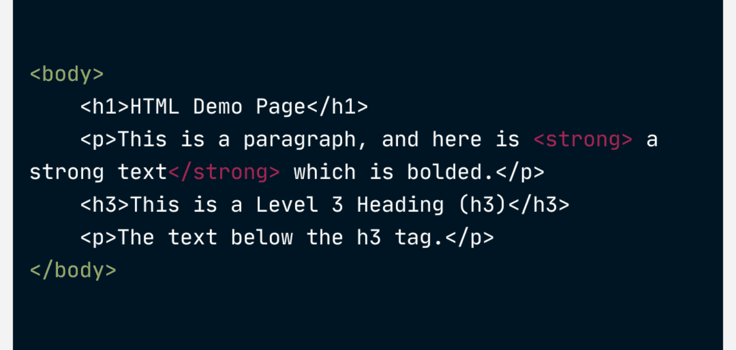
Structural Elements
Interactive Elements
Working with HTML
Writing HTML Code
Text Editors vs. Integrated Development Environments (IDEs)
Syntax Rules and Best Practices
HTML Validation
Styling HTML With CSS
Introduction to CSS (Cascading Style Sheets)
Linking CSS to HTML Documents
Applying Styles to HTML Elements
Importance of Separation: HTML for Structure and CSS for Styling
Accessibility and SEO Considerations
Creating Accessible HTML Content
SEO-Friendly HTML Practices
to helps structure your content clearly and logically. Importantly, you must use
for the main title and then progressively use
HTML5 Features and Enhancements
New Semantic Elements
Multimedia Support
Form Enhancements
Responsive Web Design
Responsive Web Design Principles

Using HTML to Create Responsive Layouts
Media Queries
Flexbox and CSS Grid for Layout Flexibility
Best Practices and Optimization Techniques
Clean and Semantic HTML Markup
Performance Optimization Tips
Cross-Browser Compatibility Considerations
Wrapping Up: Your HTML Adventure Awaits!


